
UI / UX.
Interfaces designed around real users researched, wireframed, tested and polished into a design system your developers will thank you for.
Overview
Users before
pixels.
Good UI starts long before colour. We map who your users are, what they're trying to do, and where the current experience fails them — then design flows first, screens second, so beauty never hides a broken journey.
Everything ships as a component-based design system in Figma: consistent, documented, and ready for clean developer handover.
- +
Users before pixels. Research decides; taste refines.
- +
Systems, not screens. Components scale; one-off screens don't.
- +
Tested, then trusted. Prototypes meet real users before code does.
What you receive
Everything, organised and ready to use.
- UX research & auditHeuristic review, analytics and user interviews.REPORT
- Flows & architectureUser journeys and information structure.FLOWS
- WireframesEvery key screen, resolved in grayscale first.LO-FI
- High-fidelity UIThe visual language applied across all screens.FIGMA
- Design systemTokens, components and usage documentation.SYSTEM
- Interactive prototypeClickable flows for testing and stakeholder buy-in.PROTO
Process
Four steps from brief to delivery.
-

Research
Users, analytics and competitors — the audit sets direction.
-

Structure
Flows, IA and wireframes for every key journey.
-

Design
The visual system applied screen by screen.
-

Prototype & test
Clickable prototype, user feedback, refinement, handover.
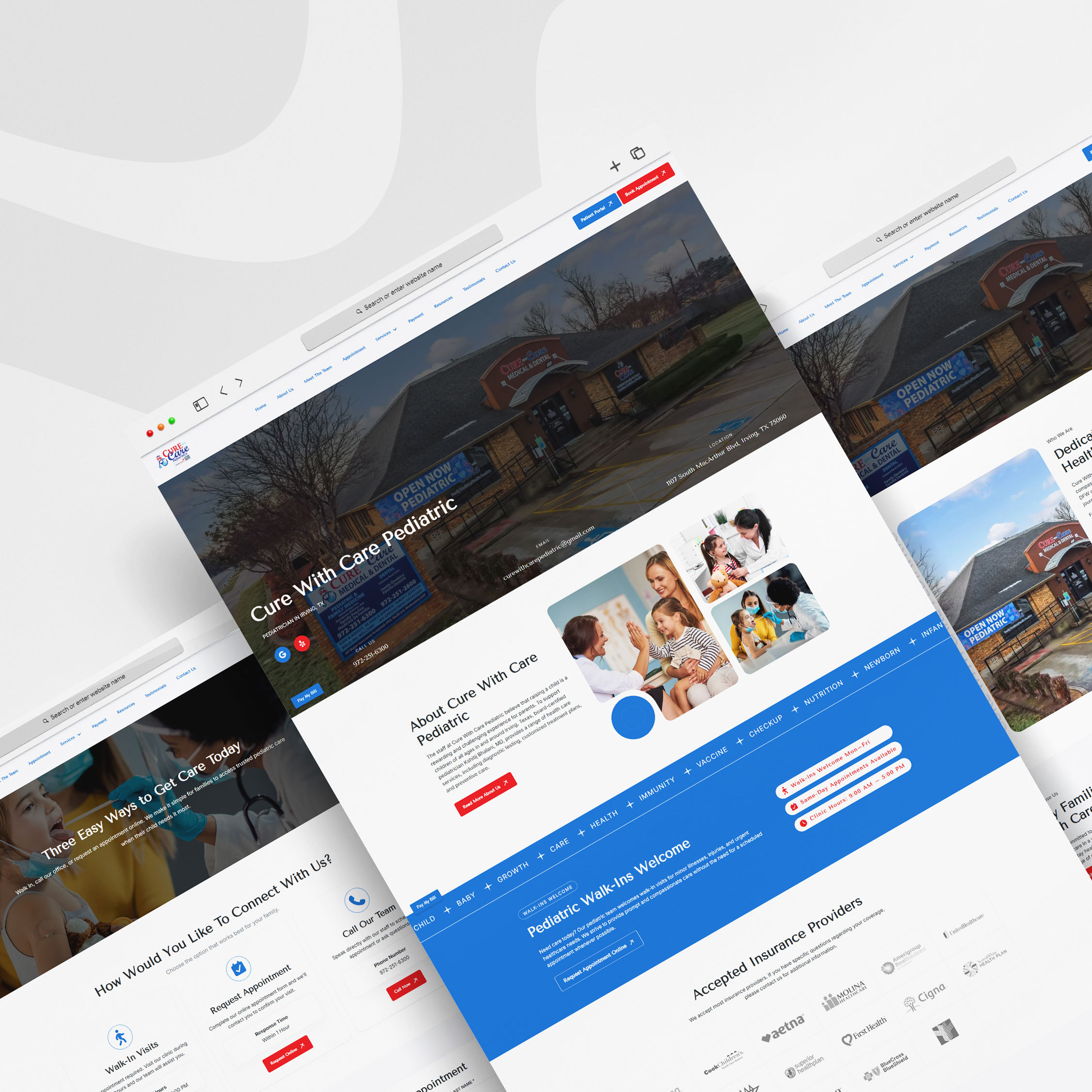
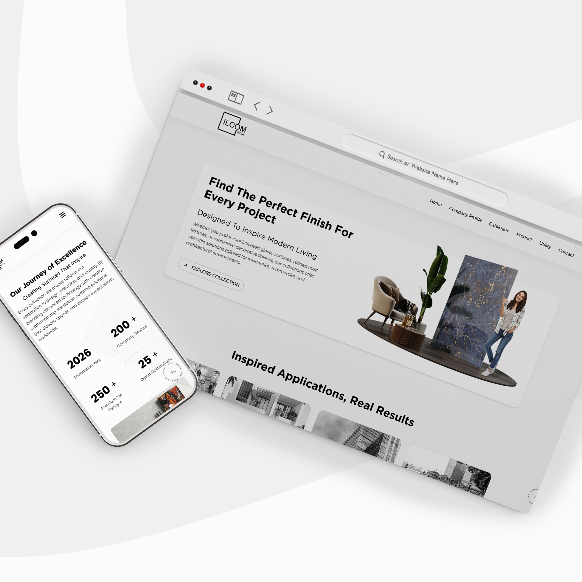
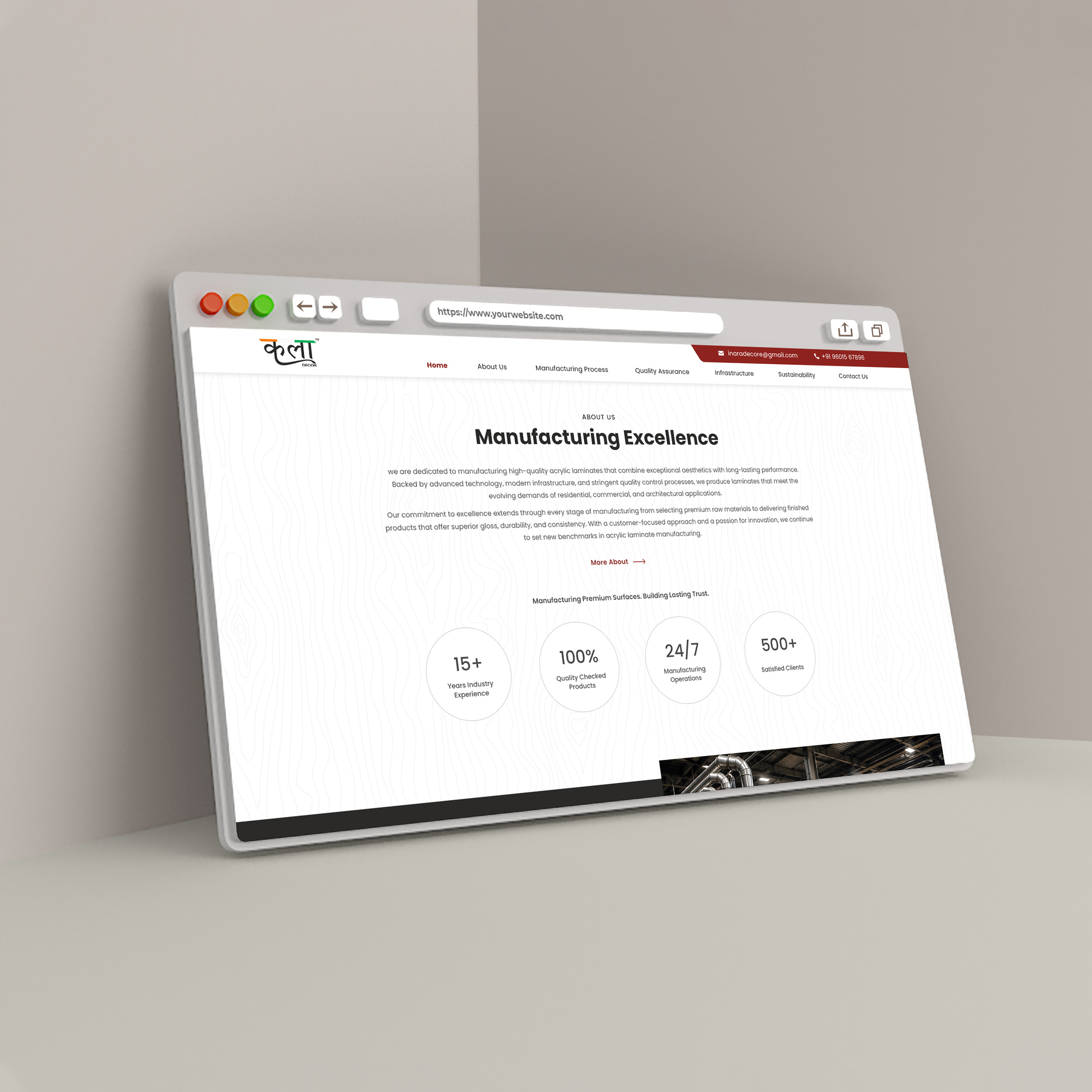
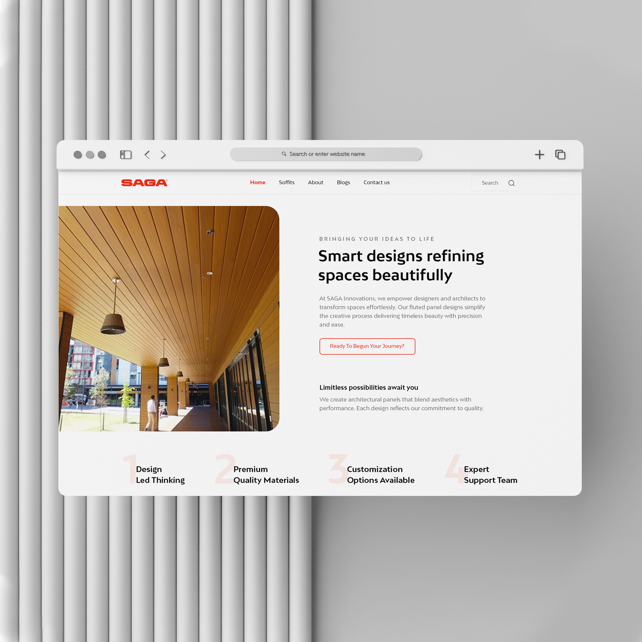
Recent work
A few from the archive.
FAQ
Good questions, straight answers.
More from Web / Application